
I made the switch to Beta Blogger this morning. Please let me know if anything looks funky. It was pretty easy. Luckily I knew to save the code for my weather, counter map, and ring to put in again thanks to someone else's post - thanks whoever you were! The one thing that went 'wrong' was that all of a sudden I was 249 years old! No wonder I felt so tired this morning. If anyone knows how to center my book images in the sidebar, I'd love to know.
I like the green better...makes the gold pop more!
ReplyDeleteIt is looking great can't wait to see what else you add to it!
Kathie in NJ
I think I prefer the green, the gold just falls a little flatter. But most importantly, what do you think?
ReplyDelete*hugs*
Tazzie
:-)
I think the green is better, but that is just me. I also think the gold will look good. I still have to make the big step to betablogger
ReplyDeleteI vote for the green too. The gold is lost as a border. I haven't switched to beta either. Too chicken I think.
ReplyDeleteGreen! (And looking NICE!)
ReplyDeleteDefinately the green. But then I'm a green lover. That was probably me about saving the code since that was the problem I ran into and blogged about.
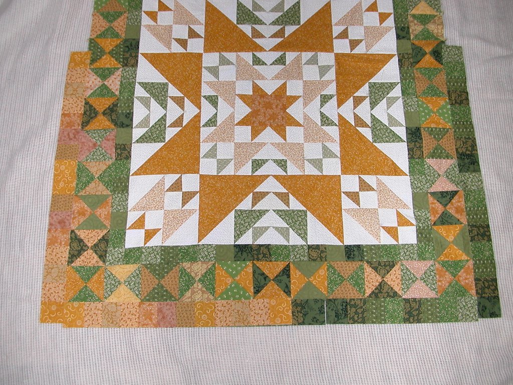
ReplyDeleteWhat a wonderful quilt!!
ReplyDeleteI like the green, it seems to just jump out. The gold is nice but to mutted to me. I looks good. I do think a lady your age should get more rest.(Hee Hee) Have a great day. Dot
ReplyDeleteLets see if this works with out being Anonymous.
ReplyDeleteAnother one in the green column. The gold makes the previous round kind of fade away, but green pops it all up to get a good look.
ReplyDeleteI am in the minority, but I do like the gold better!
ReplyDeleteI prefer the green but ... it might depend on what comes after the gold. (That's not very helpful is it?) Just go with the green.
ReplyDeleteFiona
I really like the green. Makes the center pop more. I don't have the mental energy to switch to betablogger. And I totally would have lost all my sidebar stuff, cuz I never would have thought of saving it somewhere. D'oh.
ReplyDeleteich bin für grün :)
ReplyDeleteWithout a doubt - most definitely the green - and it's looking wonderful :o)
ReplyDeleteI guess I'm in the minority, too -- I like the way the gold makes the green hourglasses "float" -- very nice effect!
ReplyDeleteI like the green--not that you need any more opinions!
ReplyDeleteCan I fence sit and say I like it with both - half and half! If I can't then I lean towards the green.
ReplyDeleteJodie
Your quilt top is coming along nicely. I have been looking at the photo for a few minutes now and can't decide what color to vote for. I'm sure it will look good whatever you decide. Can't wait to see the next round.
ReplyDeleteBeautiful, use either one, it will look great, Nancy in MT
ReplyDeleteI like the green too. However, I would probably do a combination of the two or do green on two sides and gold on the other two sides. It's going to be fantastic no matter what you choose.
ReplyDeletegreen here too, said this Johnny come lately. Heck you probably already have it sewn on the quilt by now, LOL.
ReplyDeleteGreen, definitely green, but you've probably already done it by now.
ReplyDeleteBrave you - I'm with Tonya on the switch, despite saving my template.
I'm for the gold or varigated. Sure looks good anyway. I'm scared to change too.
ReplyDelete