

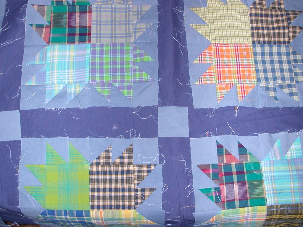
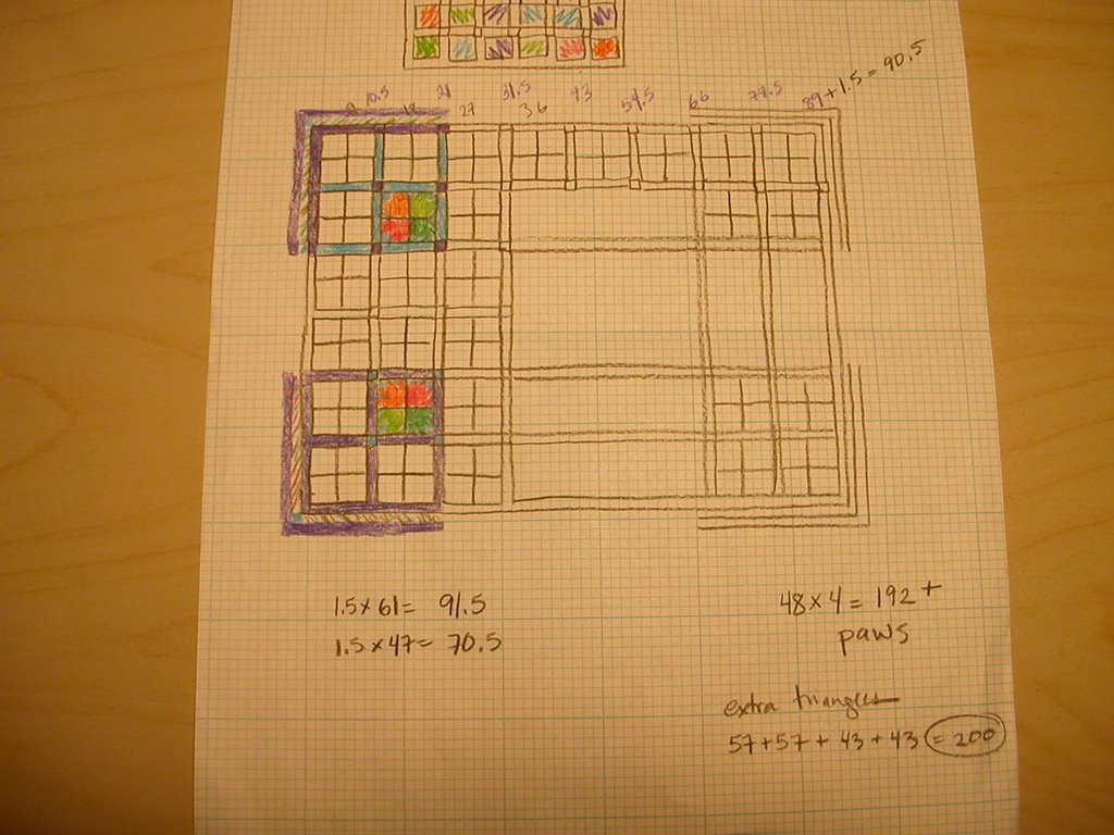
 I don't have EQ (maybe Santa will bring it? or the Easter Bunny?) and sketch things out on graph paper. When I drew this, I liked one option better, but now that I've layed it out, I like the other choice better. What do you think? (Please forgive all those stray threads - they multiplied in transit, I swear!) Light blue sashing (kinder to the inevitable chopped off bear's sharp claws) or dark blue (more contrast)? I'll have a narrow dark border, then a border of HSTs, then another dark border. Thanks for weighing in!
I've noticed people are having lots of trouble with Blogger. Sometimes if I can't see people's images, I switch back to Internet Explorer. This morning I couldn't upload photos in Mozilla, so I went to IE. This evening, I tried IE first after reading about everyone's problems - it didn't work, but worked instantly in Mozilla. Go figure.
38 comments:
If nothing else, I have an opinion....
Only for these I have two opinions:
I like the lighter sashing because it make the paws "float" & I like the darker sashing for the contrast.
Not much help, huh?
I prefer the darker sashing...
Definitely the dark (well, that's my favourite anyway).
I love those bear paws...and I think I like it best with the dark blue sashing. :) I've had a wretched time with photos and blogger. :(
And I like it with the darker blue sashing too! ;)
Hi Hedgie, I really like your bear paws...I think not to worry so much about points on claws..the bear probably broke them off scrambling over rocky river beds..*VBS*
I vote for the dark blue lattice..*S*
I see you are 19 degrees and light snow. We are almost that cold..low 30's but no snow..just wind. Hugs, Finn
Well, another mark for the dark column. I think it highlights the blocks and makes them stand out. As I recall the quilt is for a child -- if points are lost, there will nothing sharp to hurt *s*
another for the dark column
I would go for the dark. I like the contrast.
darker here too--but that's just me. The blocks appear to just be hanging around while the darker contains things a bit. Let it percolate a little longer on a design wall or laid out on the floor and see if you are more drawn to one versus the other. It is, after all, your quilt!
I'd go with the light, only because I'm more fond of "floating" blocks without a clear edge...
and the darks maintain a strong lead... add me to their column!
I like the dark blue sashing best and who cares if points are missing, it's the overall look, and the blocks are wonderful, Nancy
Dark blue. It highlites the blocks better.
I'm not much of a fan of sashing to begin with (I think it chops things up too much, instead of letting them flow together), but if I have to choose, I'd say go with the lighter sashing.
I really like the dark blue, and don't worry about the points!
Well if it is not too late I like the dark blue sashing also. It really adds something.
I like the dark blue best :) Looks great either way! xoxo melzie
One more vote for the dark. ;-)
Oh dear, it's a hard one. This is me who said no fence-sitting on my recent poll. I was immediately drawn to the dark sashing, but the more I look at it I find I like the light as well as it makes the paws 'float', as someone has said. How old is your brother? What do you think he would like the most? Probably the dark sashing...
I would go for the dark too - adds more definition and who but a quilter would check to see if the odd point is chopped off - don't worry about it - it'll look lovely and your border ideas sound great too :o)
My immediate reaction was I like the dark.
SOmeone said they kinda float with the lighter and that's true, but first reaction says dark.
Jodie
I'm preferring the dark for the contrast :)
I vote for light. I like the float too.
Boy if you ask for an opinion on blogs you sure get them! I'm with the dark side...I like the contrast and it can make the plaids come to the forefront.
At the end of the day it is your quilt..or your brothers...you know what I mean!
Siobhan
Dark sashing. Makes it more vibrant. And don't worry about the tip of those points - it doesn't matter! Just have fun sewing up the quilt.
GET EQ!!! You will absolutely LOVE it! It's so easy to learn and, once you get the hang of it, saves SO much time and is so much fun to play with too. :o)
i would like the lighter sashing, except i don't like the corner squares of the dark. so i think if you were to go w/ the lighter sashing, you need the corner squares to be light also. i think those being dark is what's causing the "float" effect, and without it, it's more like the blocks are just bigger...
so given that is the choice, i vote for the darker sashing (which looks fine w/ light cornerstones).
I like the dark sashings much better - absolutely! Too much empty space around the floating blocks with the light sashing - though that would give you a place for nice quilting.
I like the dark better. The contrast makes the plaid stand out better.
My first reaction is join the dark side, but to be fair I think I have to see it from farther away to see if I would like the floating effect.
I like the dark blue, but I understand your idea with the light blue. Sometimes we just needt to hide our mistakes. You will make the right choice.
I, too prefer the darker sashing!
I like the darker sashing too =)
I admire your ability to graph things out! I tried to make a bear paw block awhile back and it came out completely kittywampus. Precision piecing isn't my best skill though one I would like to get better at.
I have EQ but don't get a chance to use it often. I do like it, though.
BTW, I vote for the dark sashing, too. It makes the plaids really pop!
Dark is my vote too. :)
And if you are planning on getting EQ, make sure you are getting the 'newest' version, EQ6. I have EQ5 and am planning on buying the upgrade as soon as it comes out!
If you want, e-mail me and I'll draw up the bear paw quilt in EQ with both kinds of sashing options for you and e-mail them back to you.
From a machine quilter's perspective, I like the light better. I like that it appears to float & would provide better opportunities for interesting quilting as a secondary element.
I really, really love your bear paw plaids!!!
Post a Comment